Ed-tech Website Redesign
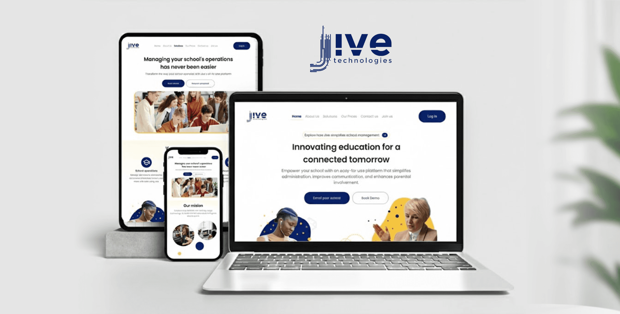
Jive Technology Website
COMPANY
Jive Technologies
ROLE
UI/UX Designer
EXPERTISE
UI Design
YEAR
2025
Project description
Website redesign focused on modern UI/UX and improved engagement
Jive Technologies helps schools and students with online learning tools designed to support both in-class and remote learning. The platform is used by a wide range of users including teachers, students, and school administrators, especially across West Africa.
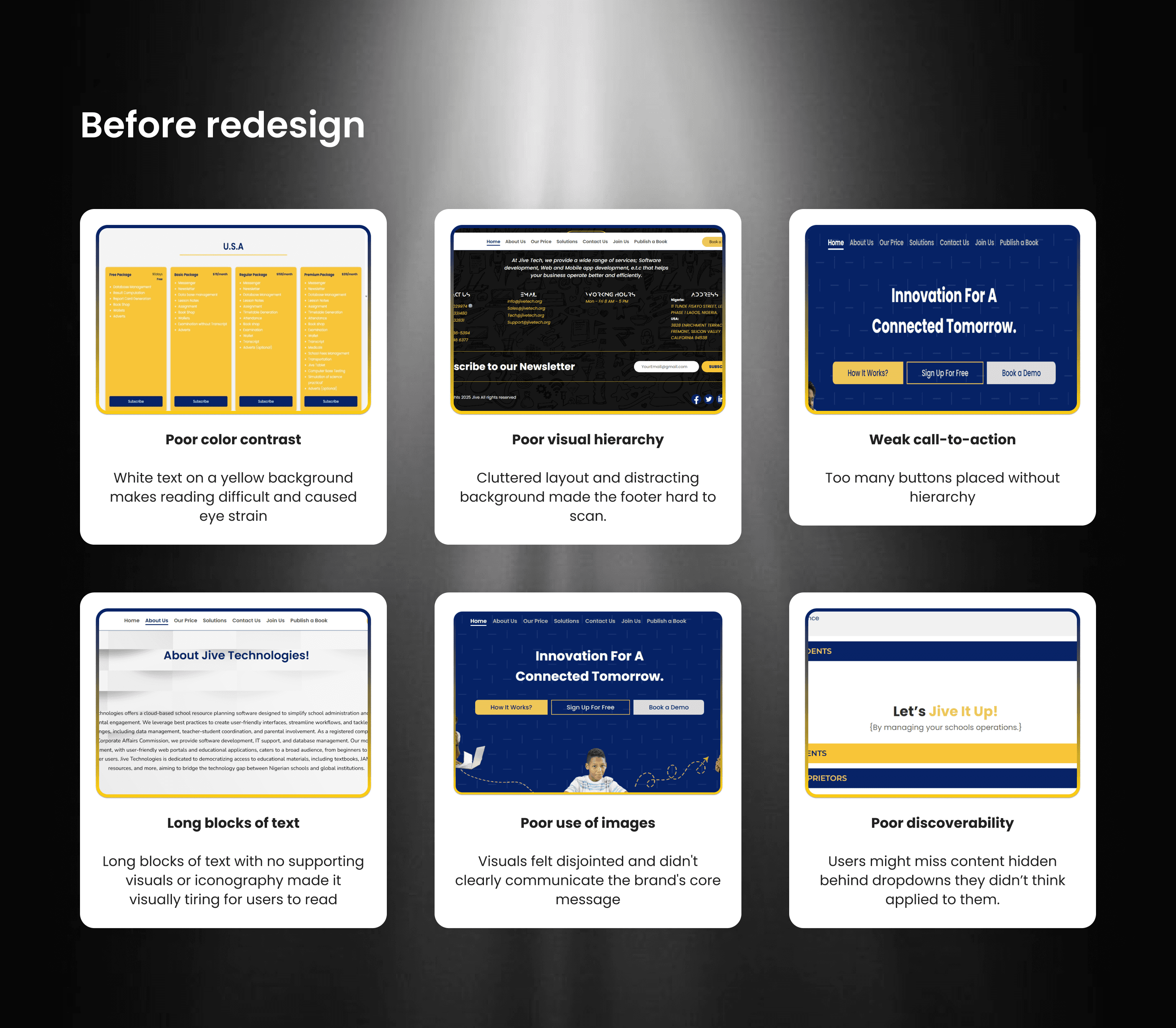
The problem
Evaluated the current interface of the website and identified some existing problems. Some key issues include:
Outdated visuals
Poor use of images
Inconsistent branding
Poor color contrast
Confusing navigation
Poor mobile performance
Weak calls-to-action
The challenge
During the redesign of the Jive Technologies website, my biggest task was retaining and clearly presenting existing important content while unifying the platform’s voice and structure into a cleaner, more modern layout.
One major challenge I encountered during my evaluation was that the original website attempted to highlight too many things at once, resulting in a lack of focus.
Competitor research
To better understand how successful EdTech platforms communicate their value, I analyzed three platforms: uLesson, Tuteria, and ClassDojo. My focus was on layout structure, trust elements, content hierarchy, and engagement strategies.
uLesson uses short, bold CTAs and colorful sections to break down features clearly
Tuteria builds trust by showing testimonials early and including user results.
ClassDojo’s friendly and inviting illustrations inspired me to use custom icons and soft visuals to make the Jive homepage feel more approachable for educators and parents alike.
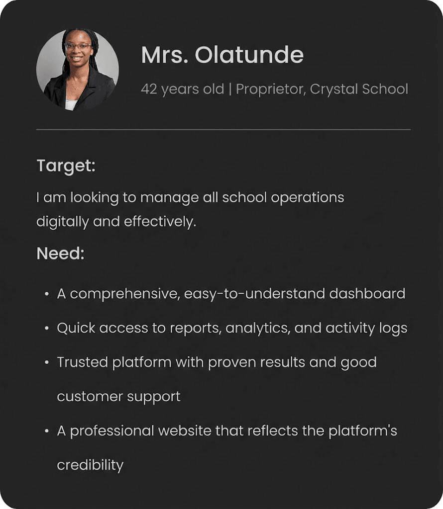
Understanding the user
Jive Technologies serves a wide range of users (Proprietors, Teachers, Parents and Students) on its platform, each with unique goals and expectations.
While the platform is designed to support all four groups, the website’s primary goal is to attract and convert Proprietors, who are the key decision-makers when it comes to adopting and implementing Jive’s solutions in schools.
How Might We?
To turn these challenges into design opportunities, I reframed insights using How Might We prompts:
How might we simplify the layout without losing important content?
How might we organize user-type information without overwhelming the homepage?
How might we guide users to take action sooner (e.g., sign up or book a demo)?
How might we display trust indicators (clients, testimonials) in a more visible and unified way?
Actions taken
Reordered content to follow a value → features → trust → action flow
Placed primary CTAs above the fold and repeated them in strategic locations
Designed a responsive grid for testimonials and client logos
Used auto-layouts and flexible containers in Figma to ensure the layout works beautifully across desktop, tablet, and mobile
Simplified navigation
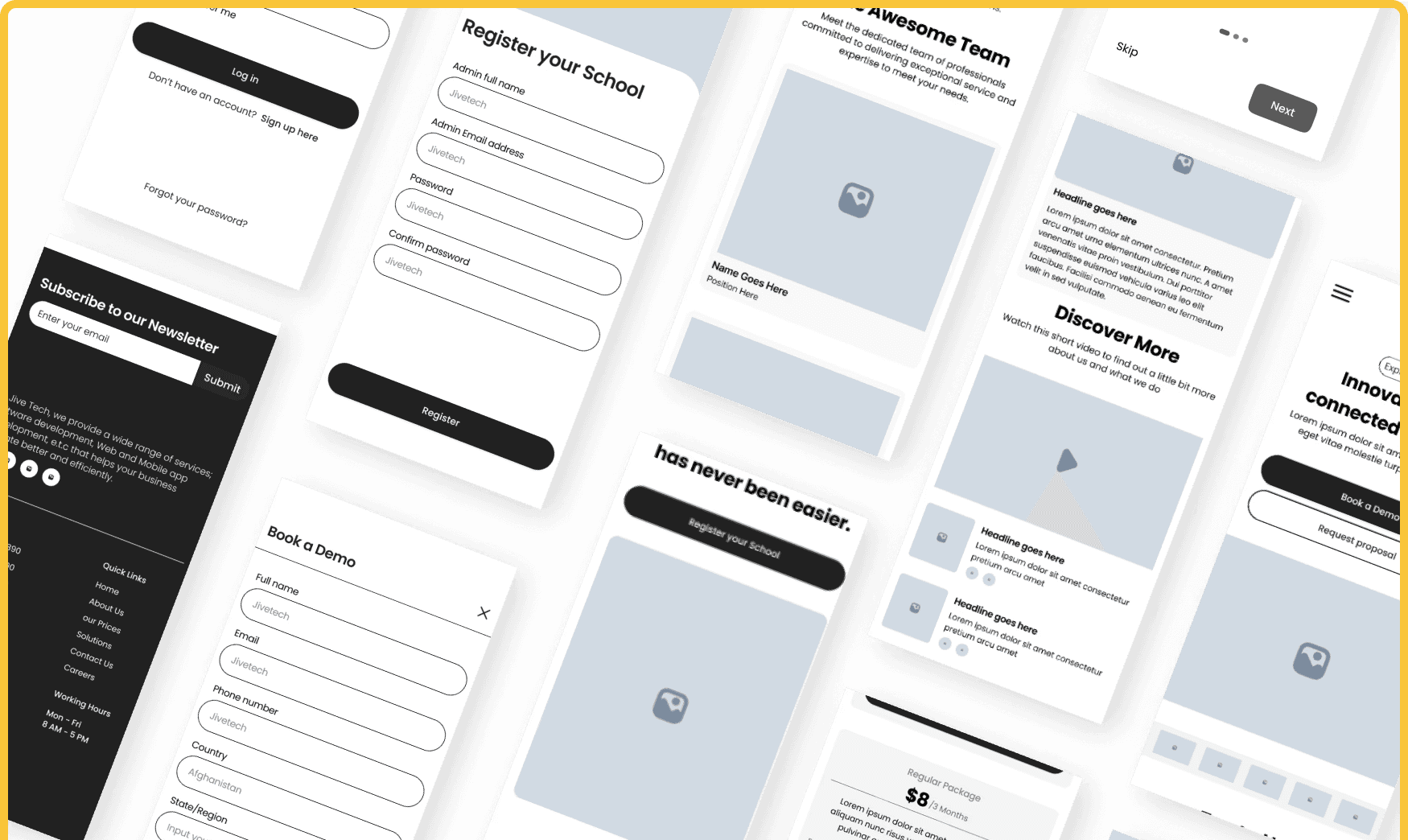
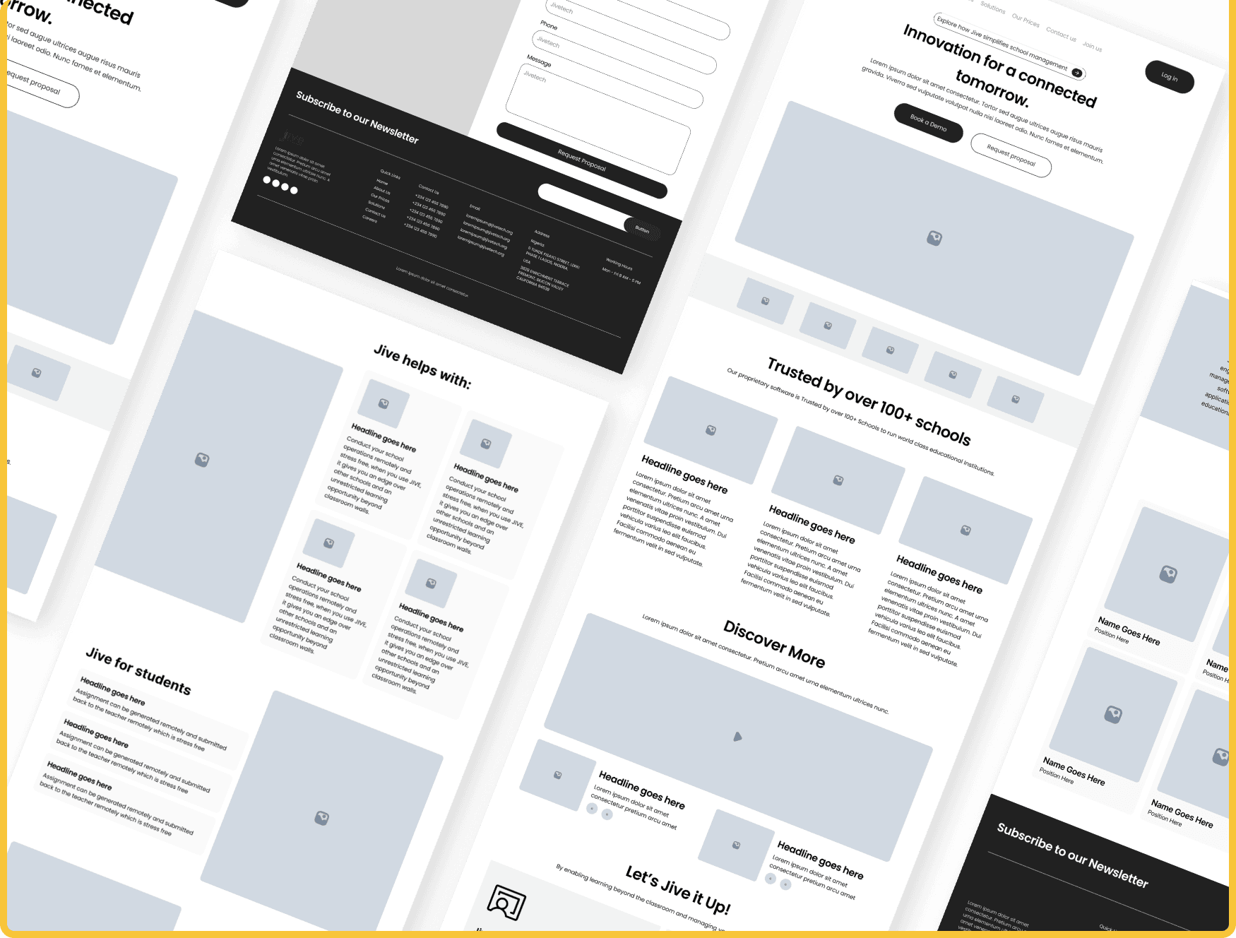
Low-Fidelity Wireframes


Outcome
Increased usability and responsiveness across devices.
More effective CTAs positioned strategically to drive demo bookings and sign-ups.
Engaging visuals
Simplifying the layout drastically improves clarity and boosts action-taking.